Our brains are extremely powerful and can process images in just around 13 milliseconds. This exceptional capability demonstrates why data visualization platforms have become crucial to advanced business intelligence.
A lot of businesses face problems with respect to data analysis despite having huge data resources.
Research showcases that around 20% to 25% of organization efficiently assess their data. Over the years, we have understood the importance of data and has become as significant as gold in the digital era, and its usefulness only increases with effective refinement and analysis.
The research of McKinsey indicates that successful organizations are three times likely to create 20% or more of their earnings from data analytics intiatives.
Visual approaches have proven their worth in transforming complex information into clear insights. The evidence shows that managers who use visual methods access timely information 28% more frequently than those using traditional reporting. Companies report that they have made 77% better decisions after they execute visualization strategies.
In this write-up, let us explore how tools for data visualization transform decision-making for business. You will find the most cutting-edge visualization and industry applications that improve your data approach. The significance of visual information goes beyond simple aesthetics. It has become crucial to maintain competitiveness in today's analytical world.
Why Data Visualization Is Important in Today’s Business?

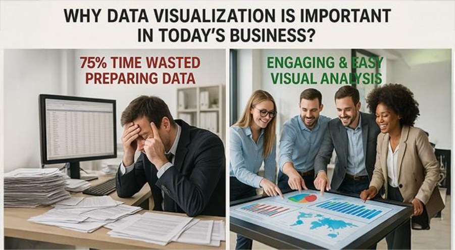
It is an incontrovertible fact that quality data alone does not guarantee in the information-rich business of today. Financial teams end up wasting around 75% of their reporting time preparing data sheets instead of analysing the data. Thus, modern businesses look simple spreadsheets and are looking to integrate user-convenient visual representations that makes data analysis engaging and easy.
Transitioning from Raw Information to Comprehensive Visual Insights
Our brains easily process images around 13 milliseconds more quickly than text. This natural ability makes us more driven toward visual data representation, which makes them critical in modern business processes. Visualizations modify complex datasets and converts them into user-friendly formats, removing the need to sift through thousands of spreadsheet rows.
Business dashboards operate like the dashboards we see in car - you notice what requires attention without going into complications. Well-crafted visualization indicates exactly what you require at the perfect time.
Teams now focus on "what should we do next?" rather than "what happened?"
Wharton School of Business research shows data visualization tools cut meeting times by 24%. Teams take informative choices based on key insights extracted from visual formats, minimizing the time required for data interpretation.
This transformation shows a radical alteration in business operations:
- Raw numbers → Visual patterns
- Data collection → Data interpretation
- Time spent compiling → Time spent analyzing
- Static reports → Interactive insights
Companies stay competitive in ever-changing environments through quick, evidence-based decisions.
Importance Of Data Visualization In Business Decision-Making
Data visualization helps businesses turn information into action effectively. Teams notice trends, patterns, and anomalies quite quickly. Decision-makers recognize opportunities worth pursuing without sifting through numbers.
Visualized data bridges communication gaps between departments. Technical and non-technical teams share a common visual language. Sales, marketing, and product teams can make a streamlined strategies courtesy of shared dashboards that makes complex data visible to all stakeholders.
Visual analytics boosts strategic planning via forecasting and scenario modelling. Interactive dashboards allow businesses notice possible outcomes by modifying variables. This leads to more evidence-based strategic decisions rather than gut feelings.
Industry experts indicate to numerous measurable advantages:
- You can easily identify problems before they become full-blown crisis.
- Identify hidden patterns from vast datasets.
- Workflow optimization enhances productivity.
- You can make sure that your business decisions become much more transparent.
- You can make the culture of your organization much stronger by making it evidence driven.
Data visualization plays a key role in communication with the regulatory agents, investors, and the media. Businesses elucidate complex data to these important audiences through organized and neat visual representations.
Organizations recruit specialists with specific data visualization skills much more frequently. The global market of data visualization will extend beyond $19.20 USD billion by 2027, ensuring central role of such capabilities in modern business processes.
Zebra BI data visualization platforms have become vital for organizations looking to enhance their decision-making processes. Understand how to convert raw information into useful visuals showcase how businesses understand their customers, operations, and market position fundamentally.
Key Benefits of Using Data Visualization for Decision-Making
Visual formats transform complex datasets and change how organizations interpret and act on information. Research indicates that managers who leverage visualization platforms are 28% more likely to promptly collect data compared to those leveraging conventional methods. This ensures a ripple effective throughout the process of decision-making.
Quicker Recognition of Patterns and Analysis of Trends
Our brains process images more quickly than text. Studies showcase that we process visual data about 60,000 times more quickly than text, which sort explains why visualization of data expedites immediate discovery. Teams can get crucial insights almost immediately from visual dashboards, while conventional reports generally take several hours to assess.
Companies leveraging customer behaviour information in their decisions notice about 85% more improvement in sales growth as compared to competitors who actively depend on dashboards.
Visual data also enhances problem-solving capabilities by around 89%, which aids teams to:
- Recognize anomalies and outliers that need attention quickly.
- Identify seasonal patterns that you cannot openly notice in raw data.
- Identify correlations between metrics that appear to be unrelated.
- Predict issues before they become major problems.
To head home this point even further, we have a Walmart case. They used geospatial visualizations to map inventory levels and sales up to the minute, which reduced stockouts by nearly one-fifth during peak periods and saved about $1.20 billion USD annually in excess inventory costs.
Improved Communication Across Departments
Great insights lose value when teams can't share them effectively across an organization. Data visualization creates a common visual language that everyone understands, whatever their technical background.
JPMorgan Chase has understood this directly. Their shared dashboards led to a 15% reduction in operational risks and a 10% improvement in decision-making speed. Visual formats ensure that complex data become available to distinct stakeholders.
Around 65% of people prefer to learn visually, so visual presentation of data makes sure critical data remains accessible and easy-to-remember across the board. Teams can remove silos and interoperate much more efficiently with this shared understanding.
Cleveland Clinic's case study effectively showcases these advantages. They brought down the diagnostic errors by close to 20% by transitioning from text-heavy to visual dashboards, from text-heavy reports to visual dashboards, which proves visualization can save lives in some contexts.
Enhanced Stakeholder Alignment
Visual data changes how stakeholders work with information and agree on critical decisions. Stakeholders can explore data on their own through interactive dashboards, which leads to better involvement in decision-making processes.
This involvement brings several key benefits:
Visual formats create a unified view of strategy across departments and keep performance data interpretation consistent. Information becomes available at all organizational levels, which increases transparency. Complex information becomes clear immediately, where text-heavy documents often fail.
Research backs these results. Organizations that use visualization effectively are 28% more likely to make timely strategic decisions. Companies with hosted visualization systems have 49% better success rates in achieving their strategic goals.
Want to find powerful data visualization tools? The right visual platform can change how your organization processes information and makes decisions.
Benefits go beyond internal operations. Visual data adds clarity to presentations for external stakeholders who learn essential findings quickly. Aberdeen Group's study found that businesses using data visualization had quicker decision cycles and better stakeholder involvement.
Evidence shows data visualization does more than make information attractive—it changes how organizations understand their data, share findings, and bring stakeholders together around strategic decisions.
Key Types of Business Data Visualizations
The right visual format can make data either confusing or crystal clear. Each type of visualization serves a unique purpose in business. Let's look at the most useful ones that match different business needs.
Bar And Line Charts For Performance Tracking
Bar and line charts are essential tools in business data analysis. A bar chart shows value through bar heights from a baseline. This makes them perfect for comparing separate categories. Teams use them to show performance metrics between groups, products, or time periods.
Line charts connect data points with straight lines to reveal trends over time. Bar charts highlight specific values, while line charts show patterns. They map variables like sales growth, website traffic, or production rates. This quality makes them valuable tools for forecasting and trend analysis.
These simple visualizations give remarkable clarity for performance tracking:
- Bar charts work best to compare discrete categories
- Line charts show continuous changes and trends over time, effectively
- Dot plots can replace bar charts when exact positioning matters more than bar length
Simple charts pack surprising power. Wharton School's research shows they cut meeting times by helping teams understand information fast without losing depth.
Heatmaps For Geographic And Density Analysis
Heatmaps show data values through color intensity. They work great to analyze geographic patterns or density distributions. The density map groups overlapping marks and uses color codes based on concentration.
Geographic analysis benefits from heatmaps that display high and low density areas of specific factors like population, network coverage, or customer concentration. Restaurant chains, retail businesses, and real estate firms use these visualizations to spot market opportunities and avoid crowded areas.
Tableau and similar data visualization tools build effective heatmaps by calculating density surfaces on your view. The view updates as you zoom or filter data, giving live insights. Teams can adjust color palettes to highlight different patterns, and intensity sliders control the visualization's vividness.
Dashboards For Real-Time Kpi Monitoring
KPI dashboards track business metrics fast and give a unified view that shows company health clearly. These dashboards combine live data from many sources into one actionable display, unlike static reports.
Modern dashboard tools let teams:
- Track every stage of business processes and make quick adjustments
- Spot top performers and celebrate success
- See current performance clearly at a glance
Dashboards shine because they update live. Geckoboard's solutions turn office TVs into live wallboards. They send scheduled snapshots to communication channels and deliver custom alerts when key metrics change.
Waterfall Charts For Financial Breakdowns
Waterfall charts (or bridge charts) display running totals as values add up and subtract. Financial experts find it crucial to see how an original value changes through positive and negative shifts.
These charts begin with a starting value on the left and end with a final value on the right. Floating columns show the changes in between.
They excel at:
- Showing profit and loss statements
- Breaking down cash flow movements
- Splitting revenue by product or region
- Matching budget against actual performance
Waterfall charts turn complex financial data into clear visuals that anyone can grasp. Teams spend less time interpreting numbers and more time planning strategy.
The best chart type depends on your data and business questions. The top data visualization tools create these charts while keeping design and user experience consistent.
Conclusion
This piece shows how data visualization turns raw numbers into useful information. Numbers tell quite a story – companies that use visual data reach decisions 28% faster and make better choices 77% of the time. Raw spreadsheets no longer bog down these companies. Instead, they surf on visual insights.
Data visualization works best when it makes complex information clear. Bar charts show performance at a glance. Heatmaps display geographic patterns. Dashboards keep track of KPIs. Waterfall charts explain financial breakdowns. Each type answers specific business questions and makes information easy to understand.
The right visualization tool matters as much as the chart type. Tableau stands out for enterprise analytics. Power BI blends naturally with Microsoft products. Looker handles embedded analytics well. Google's Looker Studio helps marketing teams track their campaigns. Your perfect match depends on your needs and current systems.
Visualization creates real business value beyond attractive graphics. Netflix plans a content strategy with it. Walmart makes supply chains better. Airbnb sets prices that change with demand. These companies turn data into a competitive edge through visual insights.
Visual formats create a common language that everyone understands. Technical and non-technical teams communicate better. Teams make faster decisions and work together more effectively.
AI keeps changing how we see data. Natural language queries and automated insights lead the way. Live data streams replace old batch processing. Interactive dashboards let users explore data on their own.
One thing remains clear - companies can't ignore data visualization anymore. Organizations that show information visually make faster, better decisions. Those stuck with traditional reports fall behind competitors who spot trends and solve problems quickly.
Want to change how your organization handles data? Take time to learn about data visualization tools that fit your business. The right visual solution might give you the edge you need in today's information-driven market.


%201.png)

%201.png)

%201.png)

