
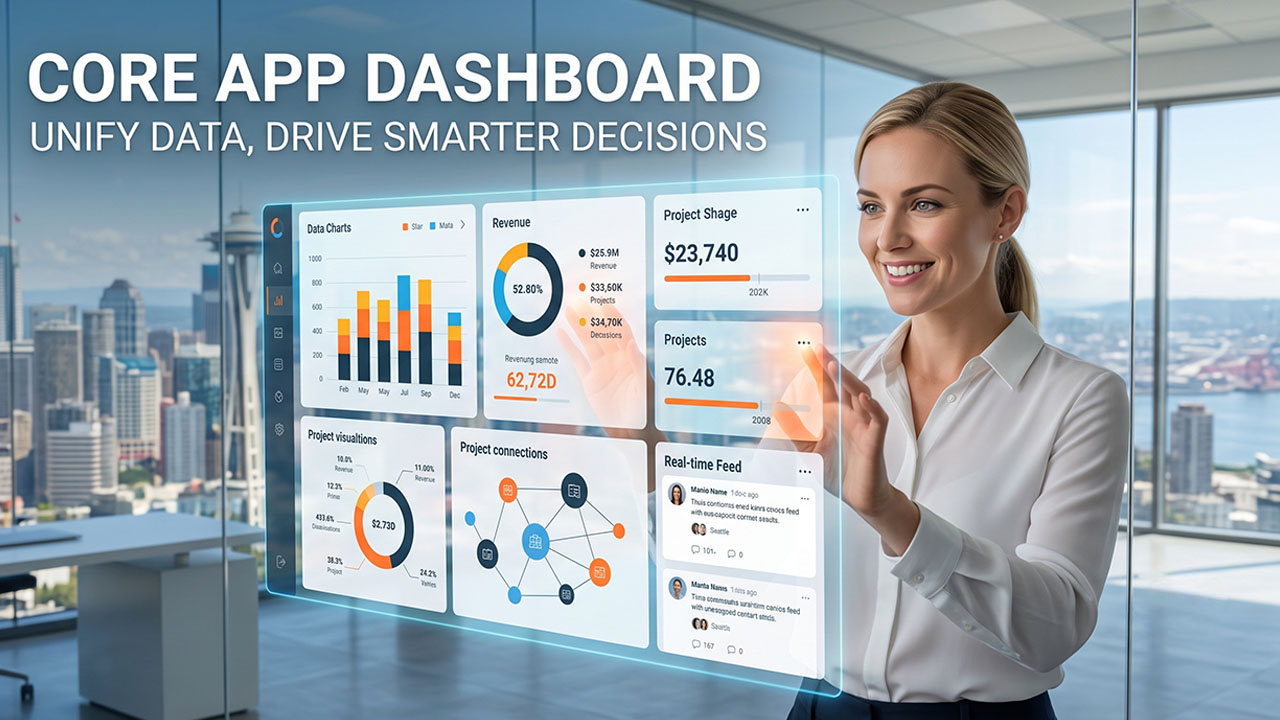

Every business drowns in data like sales figures, customer reviews, project deadlines, and expense reports. The list grows longer every week. And that data’s nowhere near organized. You’ll find bits stashed in five different apps, a couple of half-forgotten spreadsheets nobody bothers to update, and a login only people from the IT department seem to remember. This isn’t just a data issue. It’s chaos, and sooner or later, every business faces it.
That’s where a core app dashboard changes everything. It’s not just another app; it’s the one tool that finally cuts through the clutter. It pulls everything such as your apps, numbers, and metrics that you actually need to make decisions onto a single screen. There are no more scavenger hunts, just everything in one place when you need it.
What Is a Core App Dashboard?
A core app dashboard refers to the centralized interface where all data, tools, and applications live together in a single, unified view. No more jumping between five different platforms just to check sales, track support tickets, or see where a project stands. Instead, you can see everything on a single screen.
It's built to simplify how teams monitor performance, track key metrics, and make decisions without forcing anyone to jump between tabs all day. For any business managing lots of tools and departments, this dashboard doesn’t just organize information; it makes it quick and practical to use.
Top Features of a Core App Dashboard
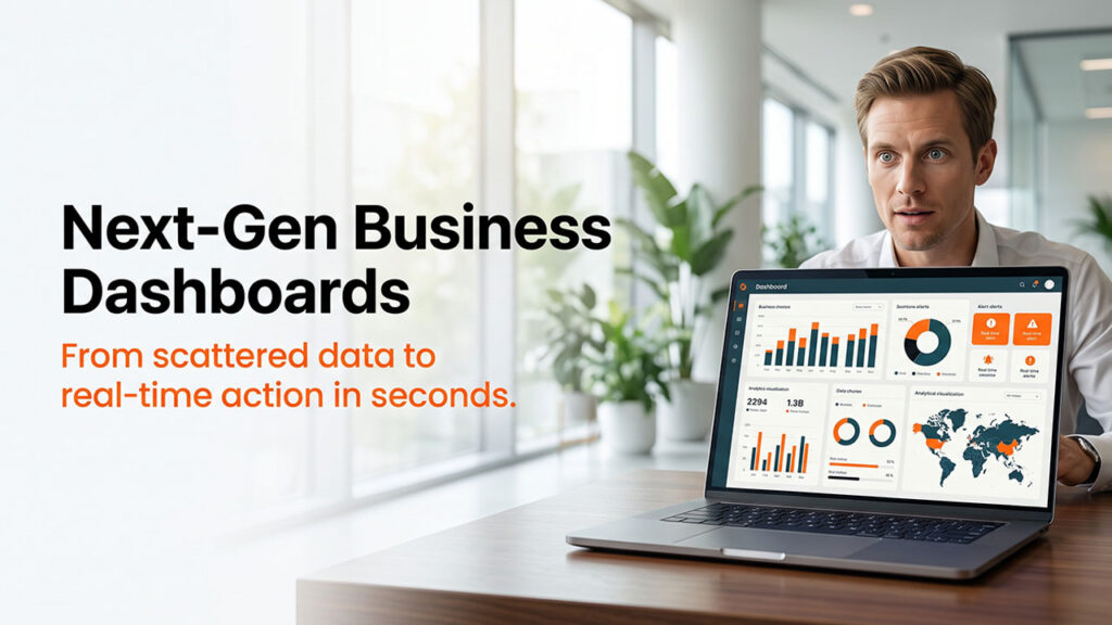
A good dashboard is the one that lets you do everything from a single screen. Here's what typically makes one worth using:
- Customizable Dashboard Layout: It lets you rearrange, add, or remove widgets depending on the metrics that your team wants to look at. It is highly flexible because no two businesses track the same things, so a rigid dashboard won’t be useful.
- Real-Time Alerts & Notifications: The dashboard tells you immediately when something needs your attention. It sends real-time alerts when you miss a deadline, sales go down, or if there’s a spike in support tickets.
- Built-in Data Analytics & Reporting: Built-in charts, graphs, and trend lines turn raw numbers into something you can actually interpret at a glance, rather than staring at a spreadsheet trying to spot a pattern. This mirrors how smart CRM dashboards turn scattered numbers into instant, actionable insight.
- Role-Based User Access & Permissions: Not everyone on your team needs to see everything. Good dashboards let you control who can see what. This matters more than people realize once teams and businesses start growing.
- Centralized Business Data Management: Every connected app or tool is pulled into the same dashboard. This eliminates the need to bounce between five different apps or tools just to get a full picture of what's happening.
- Easy-to-Use Dashboard Interface: If it takes a training session just to find last week's numbers, it's not doing its job. The best dashboards are the ones that feel obvious within minutes.
Key Benefits of Using a Core App Dashboard
Once it's set up properly, the payoff shows up pretty fast. Here's what businesses tend to notice first:
- Centralized & Accurate Business Data: You stop playing the guessing game with scattered spreadsheets. Everything funnels into one dashboard, so everyone sees the same numbers. No more chasing conflicting data or wasting time on endless email threads trying to sort it out.
- Faster, Data-Driven Decision Making: Decisions move faster. There’s no waiting for someone to compile a report. The data is always live and up to date. When you see the trends, you can act on them without getting stuck in a holding pattern.
- Improved Team Collaboration: Teamwork gets a real upgrade. When everyone shares the same data, those pointless “Where did you get that number?” debates fade away. Meetings run smoother because people aren’t sidetracked by different sets of facts.
- Clear Data Visualization: Visuals cut through the noise. Charts and graphs call your attention to key patterns, whether good or bad, in a way an endless row of numbers never could. If things start slipping, you spot it early, not when it’s too late. This is the same principle behind data visualization in CRM systems, where visuals speed up interpretation over raw numbers.
- Simplified Performance Monitoring: Performance checks get easier. You pop open the dashboard, and you can instantly see how things are going. There is no need to log into half a dozen systems first.
How to Set Up a Core App Dashboard: Step-by-Step Guide
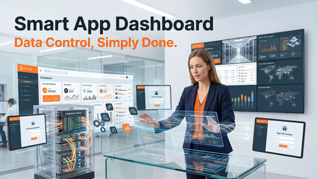
Building one from scratch doesn't have to be complicated. Here's a straightforward path:
- Define Your Goals: Be clear about what you want to measure; otherwise, your dashboard turns into a mess of distractions.
- Choose the Right Dashboard Software: Pick dashboard software that actually fits your team. If it doesn’t connect smoothly to tools you’re already using, you’ll waste a lot of time.
- Connect Existing Apps and Data Sources: This is the step that turns scattered information into a single feed.
- Customize the Layout: Link up your current apps and data sources. That’s how you pull all your information together and avoid jumping between screens all day.
- Set Permissions and Access Levels: Decide early who should get access to what. Especially when multiple departments are involved, clear permissions prevent confusion.
- Test it with the team: Run a trial with your team. Listen to their feedback because what seems obvious to you can be confusing to them.
- Review and Refine Over Time: Don’t just set it and forget it. Revisit your dashboard as your team and business change. Keep it sharp and relevant.
How to Use a Core App Dashboard Effectively
Once it's built, using it day-to-day should feel simple. Here's generally how that looks:
- Log in and land on your main overview screen, where the most important metrics are usually front and center.
- Check alerts or notifications first, since these usually flag anything that needs immediate attention.
- Move through individual widgets or panels to dig deeper into specific metrics, whether that's sales, support tickets, or project timelines.
- Use filters or date ranges to narrow down data to a specific time period or team.
- Take action directly from the dashboard where possible, whether that's assigning a task, flagging an issue, or exporting a report.
- Return regularly, not just when something feels off. Consistency is what makes a dashboard actually useful.
How to Improve App Performance with a Core App Dashboard
Having a dashboard is one thing. Actually, using it to improve how your business runs is another. The below-mentioned are a few ways to get real value out of it:
- Set your KPIs before you start building the dashboard. That way, you know what matters and why you’re even measuring it in the first place.
- Drop any widgets or metrics that you don’t use. A messy dashboard isn’t just distracting; it’s pretty much useless.
- Make it a habit to check your data regularly. Don’t wait for problems to pop up before you take a closer look.
- Set up alerts that actually help you, not ones that drown you in noise. Focus on what you really need to know.
- Every now and then, compare what the dashboard says to what’s actually happening in your business. Numbers need to match reality.
- And don’t let your dashboard get stale. As your business shifts, your dashboard should keep up. What was important half a year ago might not matter much now. Keep it up to date.
Essential Metrics to Track in a Core App Dashboard
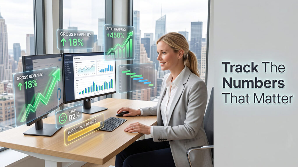
Not every metric deserves a spot on your dashboard. Here's what's actually worth keeping an eye on:
- Sales and Revenue Performance Metrics: These numbers cut through noise. They show if your business is actually growing, stuck, or sliding backward. You can stay busy and miss the real picture if you don’t check whether that effort turns into actual revenue. When you keep these figures in sight, you spot problems right away.
- Customer Support Performance Metrics: Things like response time, open tickets, and satisfaction scores show you how your customers really feel. Not just what you assume they feel.
- Project Progress and Deadline Tracking: This one's especially useful if your team is juggling more than one project at a time. If progress isn’t clear, some tasks can just quietly fall off the radar, and everyone realizes it only when there’s a last-minute scramble.
- Expense and Budget Management Metrics: Watching spend in real time means you catch overruns while they’re still small enough to handle, not after they’ve spiraled. It also makes it a lot easier to have honest conversations about budget without digging through receipts first.
- Employee Performance and Productivity Metrics: This isn't about micromanaging anyone; it's about noticing patterns. If someone's workload keeps piling up or a team's output dips for a few weeks straight, that's usually a signal they need support, not a lecture.
- Website and App Traffic & Engagement Metrics: If your business lives online, this matters. These numbers often shift before you see anything in your sales figures. Track them closely, and you get a heads-up or a warning before the dip in revenue ever hits.
Top Examples of Business Performance Dashboards
To make this a bit more concrete, here's what these dashboards often look like in practice:
- Sales Performance Dashboard: Track revenue, deals closed, and pipeline status, giving sales teams a clear view of where they stand against targets.
- Invoice and Billing dashboard: Monitor outstanding payments, overdue invoices, and cash flow, which is especially useful for finance teams keeping things on track.
- Project Management Dashboard: Show task completion, deadlines, and team workload, so nothing gets missed in the shuffle.
- Expense Tracking dashboard: Give a real-time view of spending across departments, helping catch budget issues early rather than after the fact.
- Employee Performance Dashboard: Track productivity, attendance, and goal completion, useful for HR teams and managers trying to support their people better.
Conclusion
At the end of the day, the real problem wasn’t missing data; it was chaos. Data lived in too many places, and no one had the time to pull it all together by hand. A core app dashboard doesn’t weigh your business down; it cleans things up. Every tool, every metric, every decision, all lives in one place. The companies that thrive aren’t drowning in gadgets. They’re the ones that gave their tools a home and let people actually use them.
FAQs About the Core App Dashboard
Q. What exactly is a core app dashboard?
It's a centralized screen that pulls data and tools from across your business into one unified view, so you're not checking multiple apps separately.
Q. Is a core app dashboard only useful for large businesses?
Not at all. Small businesses benefit just as much, sometimes more, since it keeps everything organized from the start rather than fixing a mess later.
Q. How long does it take to set one up?
It depends on how many tools you're connecting, but a basic setup can often be running within a few days.
Q. Can I customize what shows up on my dashboard?
Yes, that's actually one of its biggest strengths. You can prioritize the metrics that matter to your team and remove the ones that don't.
Q. Do I need technical skills to use one?
Generally, no. Most dashboards are built to be intuitive, so day-to-day use doesn't require any coding or technical background.
%201.png)

%201.png)

%201.png)