The business landscape is evolving into an artificial intelligence-driven environment that enables workflow automation, accelerates data analysis, and provides predictive analytics on a larger scale than ever before. However, with the increased complexity of AI-based systems, a paradox is emerging: the more data is generated, the greater the difficulty of delivering it clearly.
In the current business environment, communicating analysis results performed on business data will need to be done using clear visual representations. This forms a critical link between raw data and actionable insights. For companies that utilise CRM systems integrated with various tools, especially those working in rapidly changing digital environments, visually presenting information can determine whether insights drive decisions or get lost in translation.
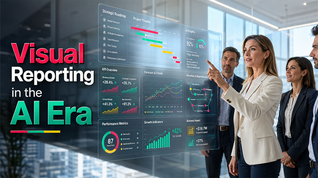
Makes Project Timelines Actionable
The use of visual reporting software to turn raw data into easy-to-understand formats such as dashboards & charts, and timelines, gives teams the ability to easily see trends, monitor their work products, and determine how best to get organised for successful project delivery.
To further explain this, consider using a visual representation of your project timelines and Gantt charts. By collating teams from various systems working on the same project, you create an overall picture of the dependencies, deadlines, and milestones; this means that all key stakeholders can understand what is happening with your project without sifting through a mass of individual updates.
Additionally, creating a visual representation of your product roadmap with key decision makers will allow your teams to get agreement on project priorities and status, as well as on longer-term strategic initiatives within a single concise format. It will therefore help prevent misunderstandings and keep everyone headed in the same direction.
Enhances Executive Stakeholder Reporting

Reporting at the executive level should be short and to the point, as well as in line with company goals. Traditional reports that involve long-form texts don't keep people's attention, nor do they typically communicate any kind of urgency to someone reading or reviewing them.
Visual reporting using tools like Microsoft PowerPoint allows teams to communicate trends, metrics and forecasts visually. A well-designed slide, with good graphical representation of data, can communicate more information to an executive in seconds than an entire paragraph of text.
For CRM-driven organisations, this is even more important because metrics such as sales performance, customer lifecycle metrics, and health of the sales pipeline can be captured visually, providing executives with an up-to-the-minute and real-time understanding of business performance, thus enhancing decision-making and developing trust in the data presented.
Builds a Culture of Clarity
Companies that emphasise visual reporting create an environment of clarity and alignment. This allows teams to spend less time interpreting data and more time working together to accomplish their goals.
The shift in culture will also lead to increased accountability. When performance metrics and project status are visible, tracking progress towards completion will be more easily identifiable and will allow addressing issues proactively.
Communicating with clarity also builds trust; whether internal or external to your organisation, clients, partners, and investors are more likely to engage with you when you present your information in a clear and concise manner.
Bridges Gaps Between Tools
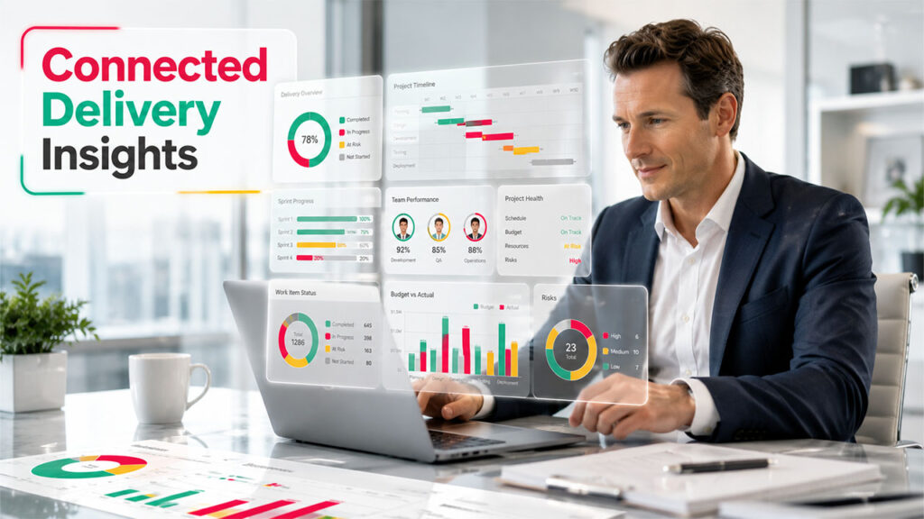
Many companies use a combination of tools, such as Jira for agile development and Microsoft Project for broader project management. Although these applications provide value individually, the difficulty comes when needing to integrate all of that information into one consolidated report.
Visual reporting provides the connection to integrate information from these systems into a single dashboard or visual summary. Ultimately, this helps the team to have a complete overview of how well things are being delivered - reducing fragmentation and miscommunication.
A good example of this is that by having development progress tracked in Jira visualised alongside project timelines in MS Project at the same time will provide a complete delivery status picture for the team. This type of alignment will help to eliminate siloed departments, save time and create greater cross-functional communication between the various departments.
Conclusion
In the AI era, data is abundant, but clarity is scarce. Businesses that succeed will not be those with the most data, but those that can communicate it most effectively.
Clear visual reporting changes complex datasets to meaningful insights, which enhances communication with all of a company's stakeholders, simplifies workflow processes and provides support for better, more informed decision-making throughout the organisation.
As AI continues to advance, the need for visual clarity will only increase, and companies putting in place sound visual reporting practices now will be in an advantageous position to thrive in a future dictated by data.
%201.png)

%201.png)

%201.png)